This tutorial shows you how to draw XY line charts using JFreechart - the most popular chart generation framework in Java. An XY line chart is suitable for representing dataset in form of series of (x, y) points, such as mathematical graphs, coordinate-based objects, etc. Finally, you will able to create a chart looks like the following:NOTE: To use JFreechart in your project, add the following JAR files to the project’s classpath:
jcommon-VERSION.jar
jfreechart-VERSION.jar
1. A Java Swing program for XY line chart example
Here is the skeleton of a Swing program that demonstrates how to draw an XY line chart:
/**
 * This program demonstrates how to draw XY line chart with XYDataset
 * using JFreechart library.
 * @author www.codejava.net
 *
 */
public class XYLineChartExample extends JFrame {

	public XYLineChartExample() {
		super("XY Line Chart Example with JFreechart");

		JPanel chartPanel = createChartPanel();
		add(chartPanel, BorderLayout.CENTER);

		setSize(640, 480);
		setDefaultCloseOperation(JFrame.EXIT_ON_CLOSE);
		setLocationRelativeTo(null);
	}

	private JPanel createChartPanel() {
		// creates a line chart object
		// returns the chart panel
	}

	private XYDataset createDataset() {
		// creates an XY dataset...
		// returns the dataset
	}

	public static void main(String[] args) {
		SwingUtilities.invokeLater(new Runnable() {
			@Override
			public void run() {
				new XYLineChartExample().setVisible(true);
			}
		});
	}
}
This program displays a window that contains a chart panel generated by JFreechart. Now, we are going to see the detailed implementations of the createChartPanel() and createDataset() methods.
2. Creating an XY dataset
Write code for the createDataset() method as follows:
This creates some dummy data for an XYDataset which is required by the ChartFactory.createXYLineChart() method. The XYSeriesCollection class is an XYDataset’s implementation which holds a collection of XYSeries. The usage is pretty straightforward. Here are the steps to add (x, y) data for a series:
XYSeriesCollection dataset = new XYSeriesCollection();
XYSeries series1 = new XYSeries("Series Name");

series1.add(x1, y1);
series1.add(x2, y2);
// ...
series1.add(xN, yN);

dataset.addSeries(series1);
Note that, by default, the XYSeries class will sort the added items into ascending order by x-values, and duplicate x-values are permitted. If you want to change the defaults, use the appropriate constructors as follows:
boolean autoSort = false;
XYSeries series = new XYSeries("Object 1", autoSort);
Or:
boolean autoSort = false;
boolean allowDuplicateXValues = false;
XYSeries series = new XYSeries("Object 1", autoSort, allowDuplicateXValues);
In reality, the data can be loaded from database, text files, CSV files, Excel files, etc.
3. Creating an XY line chart
Write code for the createChartPanel() method as follows:
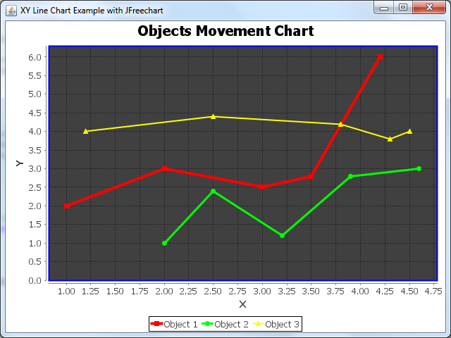
The following screenshot is taken when running the above Swing program that creates the line chart using the first method:The second variant of the createXYLineChart() method allows us to specify the plot orientation, show/hide the legend box… Here’s an example:
Here’s the result (the orientation is reversed and there is no legend):
4. Some customizations for XY line chart
Here are some examples of chart customization provided for your references, in case the default look and feel doesn’t suite your needs.Basically, we get a reference of the plot from the chart to do the customizations on the plot instance:
XYPlot plot = chart.getXYPlot();
Setting custom renderer for the series lines:
XYLineAndShapeRenderer renderer = new XYLineAndShapeRenderer();
plot.setRenderer(renderer);
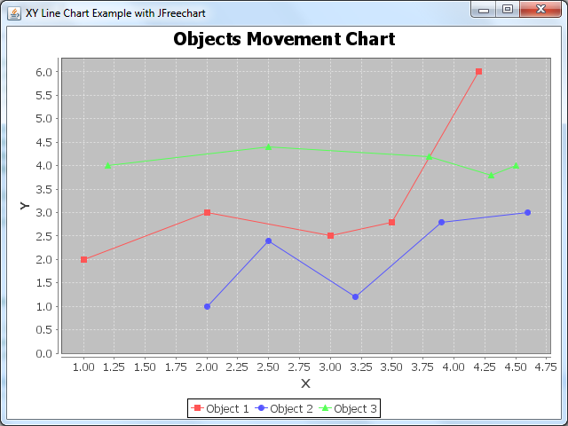
Output:Setting custom paint color and stroke for each series line:
XYLineAndShapeRenderer renderer = new XYLineAndShapeRenderer();

// sets paint color for each series
renderer.setSeriesPaint(0, Color.RED);
renderer.setSeriesPaint(1, Color.GREEN);
renderer.setSeriesPaint(2, Color.YELLOW);

// sets thickness for series (using strokes)
renderer.setSeriesStroke(0, new BasicStroke(4.0f));
renderer.setSeriesStroke(1, new BasicStroke(3.0f));
renderer.setSeriesStroke(2, new BasicStroke(2.0f));

plot.setRenderer(renderer);
Output:Setting custom paint color and stroke for the plot’s outlines (chart borders):
And here is the result of all the customizations above:
5. Saving the chart as an image
The ChartUtilities class provides some methods which we can use to export the chart graphics to an image file. For example, the following code snippet saves the chart to a PNG image file:
File imageFile = new File("XYLineChart.png");
int width = 640;
int height = 480;

try {
	ChartUtilities.saveChartAsPNG(imageFile, chart, width, height);
} catch (IOException ex) {
	System.err.println(ex);
}
To save as JPEG image, use the saveChartAsJPEG() method.
Nam Ha Minh is certified Java programmer (SCJP and SCWCD). He began programming with Java back in the days of Java 1.4 and has been passionate about it ever since. You can connect with him on Facebook and watch his Java videos on YouTube.
 NOTE: To use JFreechart in your project, add the following JAR files to the project’s classpath:
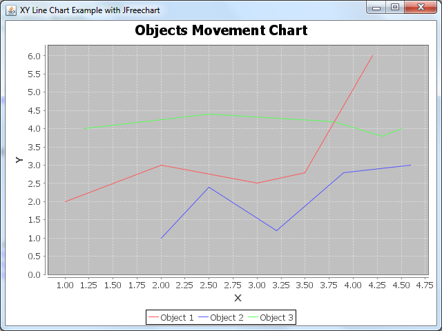 The second variant of the createXYLineChart() method allows us to specify the plot orientation, show/hide the legend box… Here’s an example:
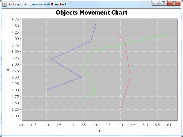
 Setting custom paint color and stroke for each series line:
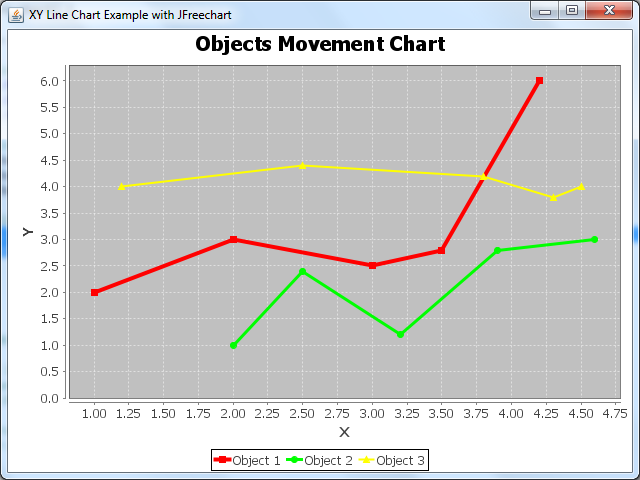 Setting custom paint color and stroke for the plot’s outlines (chart borders):
 Nam Ha Minh is certified Java programmer (SCJP and SCWCD). He began programming with Java back in the days of Java 1.4 and has been passionate about it ever since. You can connect with him on Facebook and watch his Java videos on YouTube.
Comments
Quoting JoshiKiran:
www.codejava.net"is the greatest website! thank tou so much!
can you please tell me how can we remove the extra line along the x and y axis, its not the border but a line along the x and y axis.
Thank you